Scroll a parking lot in 2025 and you’ll see something striking: the badges have changed. Electric car logos look cleaner, flatter, more digital, less like chrome war medals, more like app icons. They’re also doing serious work, signaling technology, sustainability, and status in a market where most cars are whisper‑quiet and blisteringly quick.
EV logos are the new elevator pitch
Why electric car logos matter more than ever
Logos have always mattered in the car world. A prancing horse or a three‑pointed star once told you everything you needed to know about power and prestige. In the EV era, electric car logos carry new jobs: they sell software, sustainability, range, charging access, even how tech‑savvy you look when you plug in at Whole Foods.
What an EV logo is telling you in 3 seconds
You’re not just buying a battery; you’re buying a story.
Technology & innovation
A sharp, minimal badge screams software, autonomy, and over‑the‑air updates. Tesla, Rivian, Nio and others lean into this "consumer electronics" vibe.
Sustainability signal
Subtle greens, circular motifs and aerodynamic shapes whisper, not shout, about eco‑credentials. It’s virtue signaling, but tastefully done.
Trust & long‑term value
When you’re buying used, a recognizable EV logo can translate into buyer trust, easier resale, and better financing options through platforms like Recharged.
Buying used? Watch the badge.
The anatomy of a modern electric car logo
Most modern EV logos are built from the same toolkit: geometric shapes, negative space, and a studied restraint that would make a Bauhaus designer nod in approval. Underneath the styling, you’ll usually find three layers of meaning.
- Core symbol: a letterform (Tesla T), compass (Rivian), or abstract shape (BYD’s Yangwang lightning glyph) that can stand alone on a phone screen or steering wheel.
- Story hook: a subtle nod to heritage or tech, Citroën’s chevrons from a herringbone gear, Tesla’s cross‑section of an electric motor, Volkswagen’s compressed “VW” in a simplified circle.
- EV era tweak: flat design, simplified lines, monochrome or soft color gradients so the logo still reads clearly on screens, apps, and digital dashboards.

Iconic electric car logos and what they mean
A quick glance at today’s most recognized EV logos
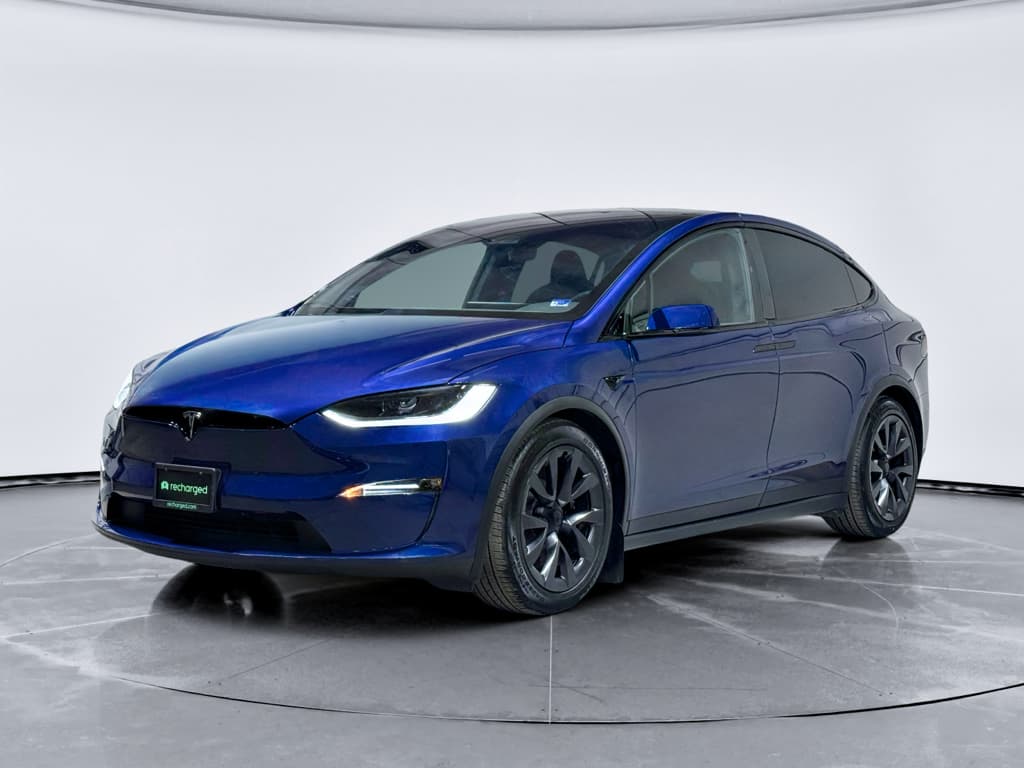
Tesla: the electric motor in disguise
Tesla’s logo looks like a simple, stylized T, but Elon Musk has noted that it’s actually inspired by a cross‑section of an electric motor, with the vertical line as the rotor and the curved top as part of the stator. Once you see it, you can’t unsee it. It’s branding as engineering diagram, and it perfectly matches Tesla’s pitch: hardcore tech, minimal theatrics.
- Early Teslas wore a shield behind the T; by 2017 the company dropped the shield, leaving the standalone mark, like a tech startup shedding its necktie.
- The logo is so pared back it works on everything from a steering wheel to a phone app icon and even a Supercharger pylon.
- You’ll see it in silver, black, or body‑color; the meaning doesn’t change, but a black T on white has become the de facto icon of Silicon Valley smugness.
Rivian: a compass for adventure
Rivian’s diamond‑shaped logo, four arrows pointing to a hollow center, is a stylized compass. The idea is simple: this is the EV for people who don’t want to stay in their lane. The negative space in the middle suggests a trailhead, a meeting point, or just the idea that the journey matters more than the destination.
- The badge looks equally at home on a pickup or adventure SUV, which is kind of the point.
- On screen, the angular geometry makes it easy to animate in the Rivian app and on the infotainment system.
- In the used market, that compass has become shorthand for "overbuilt, over‑engineered electric truck."
BYD & Yangwang: lightning in ancient script
China’s BYD uses a clean wordmark on most global models, but its ultra‑luxury sub‑brand Yangwang leans deeper into symbolism. The Yangwang badge is a stylized version of the ancient Chinese character for lightning or electricity, etched into a circular frame. For an EV brand, you don’t get a more direct visual metaphor than a literal bolt of power written in 3,000‑year‑old script.
- It’s both futuristic and archaeological, tying cutting‑edge EV tech to cultural heritage.
- On vehicles like the Yangwang U8 SUV, the logo glows, turning the car itself into a rolling billboard.
- If you spot one in a U.S. port photo or gray‑market import listing, you’re looking at one of the most expensive Chinese EVs money can buy.
Nio & Onvo: horizon and family journey
Nio’s logo, often seen on sleek sedans and crossovers, is a two‑part symbol: an arc on top (the sky) and a pillar below (the road or horizon). It’s a surprisingly poetic image for a data‑driven EV brand, standing for "moving forward while being grounded." Nio’s newer mass‑market sub‑brand Onvo uses a simpler, rounded wordmark aimed at families, but the design language is similar: friendly, approachable, quietly high‑tech.
Logos as passports
Legacy brands: how their logos evolved for EVs
If you’ve been around cars long enough to remember key fobs that looked like submarine switches, you know most legacy badges were born in the analog era, raised chrome, intricate shading, coats of arms. To survive the EV shift and the tyranny of the smartphone screen, classic automakers have quietly sanded their logos down.
Volkswagen: flattening the people’s badge
Volkswagen’s "VW in a circle" logo has been around since the 1930s, but the electric ID line pushed it into full modernist rehab. On the ID.4 and friends, the badge is simplified and flattened: thinner lines, more negative space, often backlit on the grille panel so it glows like a status LED.
- The flatter VW reads crisply in the corner of an app or a digital instrument cluster.
- Lighting the badge makes up for the lack of a traditional grille, giving the front end a signature look at night.
- On a used ID.4, that glowing VW is a quick tell you’re looking at a post‑diesel‑gate, fully electrified Volkswagen rather than just another compact crossover.
Citroën: back to the chevrons’ roots
Citroën’s double chevron logo began life not as art but as engineering: André Citroën fell in love with a herringbone gear design, and the emblem is literally two chevrons representing those interlocking teeth. In 2022, as the brand leaned harder into affordable EVs, Citroën revived an updated version of its original 1919 oval logo, a subtle nod that the electric age is just another engineering challenge to solve.
Same logo, different drivetrain
New Chinese EV brands and their symbols
If the last EV wave was about Tesla and its copycats, the current surge is being written in Mandarin. New Chinese brands are arriving with logos that feel like they were designed first for superapps and only second for sheet metal.
Emerging Chinese EV brands and their badges
A whirlwind tour of the new players shaping future driveways.
Stelato & SAIC EV sub‑brands
Huawei‑linked marques like Stelato and SAIC’s new EV brand use sleek, almost jewelry‑like emblems, delicate lines in ovals or shields that look equally at home in a smartphone UI.
Fangchengbao (Formula Leopard)
A performance‑oriented BYD sub‑brand with a logo that hints at motion and animal power. Even the name, Formula Leopard, sounds like an NFT collection, in a good way.
Mass‑market icons
Brands like Onvo lean on soft, rounded wordmarks and simple glyphs, projecting affordability and warmth rather than raw speed.
Premium positioning
Yangwang’s ancient‑script lightning logo makes it instantly clear this isn’t a budget EV. The badge itself is almost a luxury object.
Import shoppers, read the fine print
Design trends shaping electric car logos
Strip away the brand names and you’ll notice the same visual grammar repeating across modern EV badges. This isn’t groupthink; it’s adaptation. Logos now have to live on a 6‑inch slab of glass as much as on a 6‑foot car.
Key design trends in electric car logos
How EV logos differ from the gas‑era badges they’re replacing.
| Trend | What it looks like | Why it works for EVs | Example |
|---|---|---|---|
| Flat design | Minimal shading, 2D outlines | Renders cleanly on screens and tiny icons | Volkswagen, Citroën, Kia |
| Monochrome & light | Black, white, or gentle gradients | Suggests tech, simplicity, and cleanliness | Tesla, Polestar |
| Geometric abstraction | Circles, diamonds, arcs | Feels futuristic without language barriers | Rivian, Nio, BYD sub‑brands |
| Illuminated badges | Backlit logos on the nose or tail | Replaces grille drama; unique night signature | VW ID series, Mercedes EQ models |
| Wordmark-first | Text logo more than symbol | Useful for new brands building name recognition | Lucid, VinFast |
Use this as a cheat sheet when you’re trying to decode a new badge at a glance.
Why everything looks "techy" now
EV brands want to be compared to phones and laptops, not carburetors and carburettors. Clean lines and minimalism cue "software company that happens to make cars", which, in a subscription‑era world, is exactly the narrative they want.
What it means for the driveway
Park a chrome‑heavy 2010 sedan next to a modern EV and the older badge suddenly looks fussy. If you’re moving from gas to electric, don’t be surprised if the logo change alone makes your old car feel a decade older overnight.
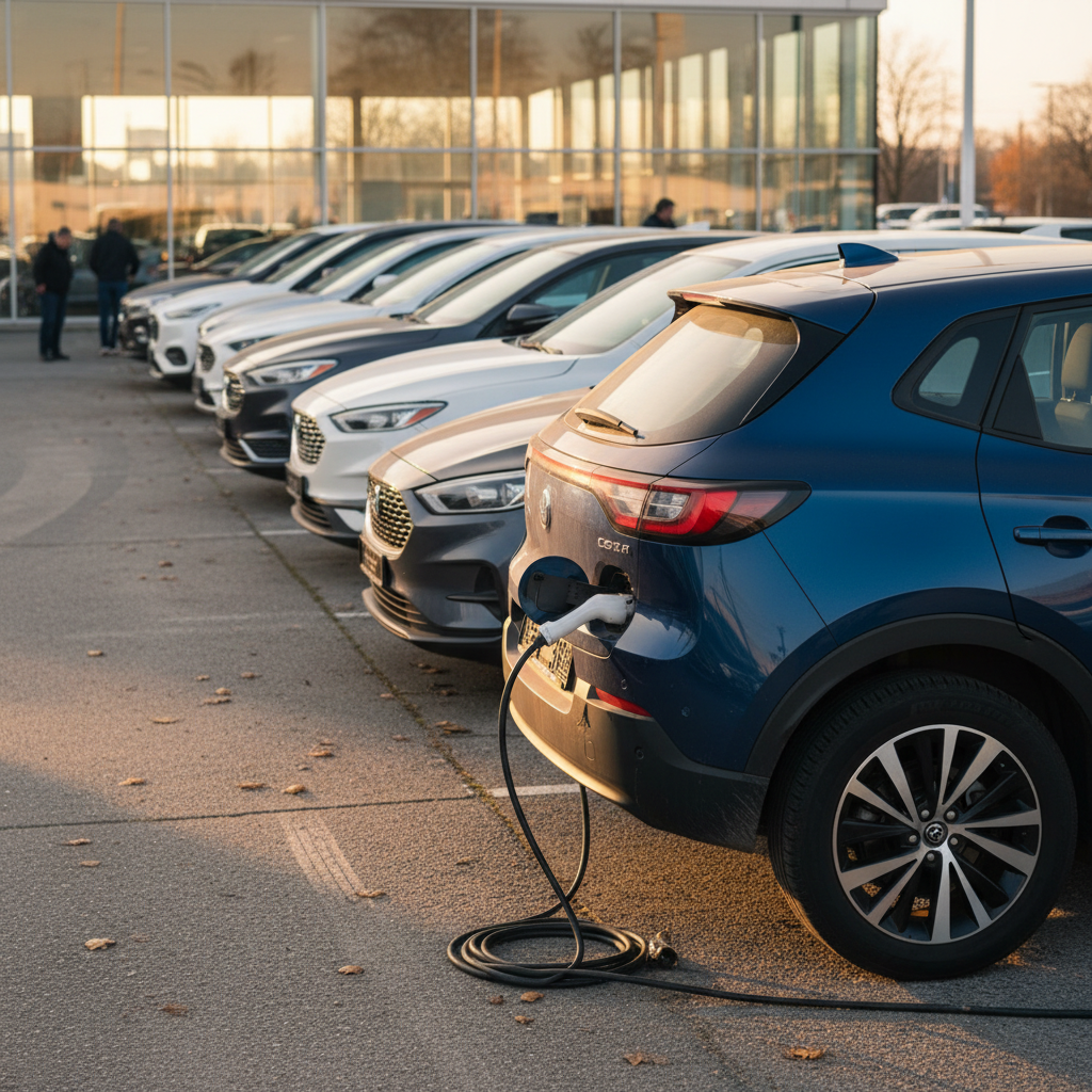
How logos influence perception and used EV value
Here’s the unromantic truth: logos affect resale. Not because the badge has magical metals, but because it bundles a thousand headlines, reviews, and TikToks into one gut reaction. When a buyer sees a familiar electric car logo, they’re really seeing a mental spreadsheet of reliability, charging access, and tech support.
What a logo quietly signals to used EV buyers
Brand perception still weighs heavily, Recharged helps you cut through the hype.
Range & performance expectations
Tesla or Lucid badges instantly conjure long‑range, high‑performance associations, even if the specific trim is more modest.
Charging access
Some logos carry an implied promise of stronger charging networks or better compatibility. A buyer may feel safer with a brand that plays nicely with major fast‑charging providers.
Emotional pull
Design‑forward badges, think Polestar or Rivian, can punch above their weight in resale because people simply like what they see in their driveway.
Where Recharged comes in
Ready to find your next EV?
Browse VehiclesHow to spot electric vs gas models by the badge
Manufacturers love to amortize design across multiple drivetrains, which means a gas SUV and its electric twin can look nearly identical from across the street. The logo often gets a tiny costume change, if you know what to look for.
Quick checklist: Is that badge hiding a battery?
1. Look for "e" or "EV" suffixes
Many brands tack a small "e", "EV", or "EQ" near the logo or model name. It’s subtle, but it’s there if you’re close enough to read the trunk lid.
2. Watch for blue or teal accents
Legacy brands love blue glows and outlines on their logos to suggest electrification. Think of it as the automotive equivalent of a "clean energy" filter.
3. Check the grille, or lack thereof
A smoothed‑over front fascia or smaller grille opening, sometimes with a lit badge, is a strong EV tell. Gas engines need airflow; battery packs don’t.
4. Scan for dedicated EV sub‑brand logos
Badges like Hyundai’s Ioniq, Mercedes EQ, or BMW i series signal that you’re looking at an electric‑first platform, not just a gas car with a plug stapled on.
5. Look near the charge port
Some EVs wear a tiny logo or color accent around the charge door. If you’re touring a used lot, asking to see the charge flap is the quickest truth test.
6. Confirm with the spec sheet
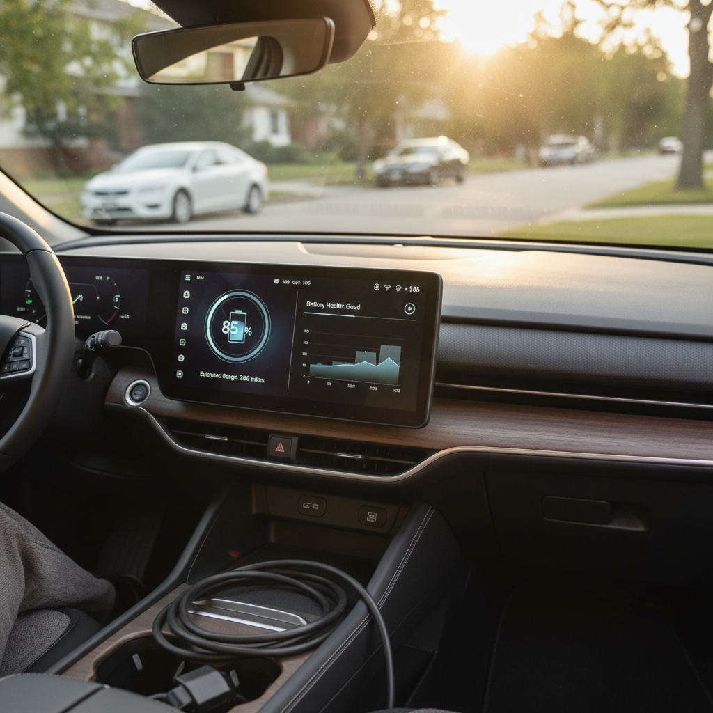
Logos are clues, not proof. On Recharged, every listing spells out battery size, charging capability, and range so you’re never guessing from badges alone.
FAQ: electric car logos
Frequently asked questions about electric car logos
The bottom line on electric car logos
Logos have always been little lies we tell ourselves about cars. In the electric era, the lie has just gotten sleeker. Electric car logos are doing triple duty now, selling you on tech, on conscience, and on the idea that your car is as modern as your phone. They can absolutely affect how a used EV feels in your driveway and how easy it is to sell, but they’re still just symbols.
When you’re browsing used EVs on Recharged, enjoy the badges, decode the compasses, the lightning glyphs, the minimalist monograms. Then let the Recharged Score Report bring you back to reality with battery health, pricing fairness, and expert guidance. The logo gets you to click; the numbers tell you whether it’s the right electric car for your life.